

CREATIVE DIRECTION
GRAPHIC DESIGN
COPYWRITING & EDITING
DECK DESIGN
PITCHING & PRESENTING
When I transitioned from in-house to agency life about seven years ago, I was caught off guard by the intensity of the pitch process. Since then, I’ve worked on about 20 pitches—each one its own kind of creative birth (metaphorically speaking). Demanding, fast-paced, and deeply collaborative, RFPs have sharpened my instincts and stretched my skill set. They’ve taught me how to sell an idea, think on my feet, and lead with clarity under pressure—lessons that have shaped me into the creative I am today.
This was such a fun one. AMP, an app by Amazon Music, let users DJ their own radio stations—a concept that let us go all-in on music and culture. The challenge was translating features into clear, compelling reasons to care. That’s where the strategist in me showed up. I developed the creative platform “All Together Now,” which mapped seamlessly to three content pillars, each tied to a core RTB. The visual identity was equally rewarding—bold, expressive, and crafted around the energy and creativity music inspires. Did I mention, we won the pitch?
AMP
EQUINOX
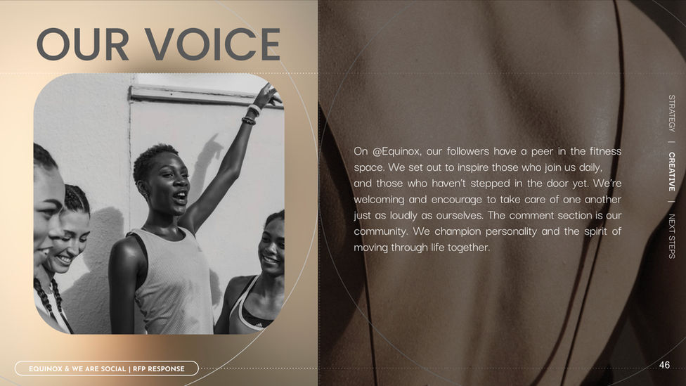
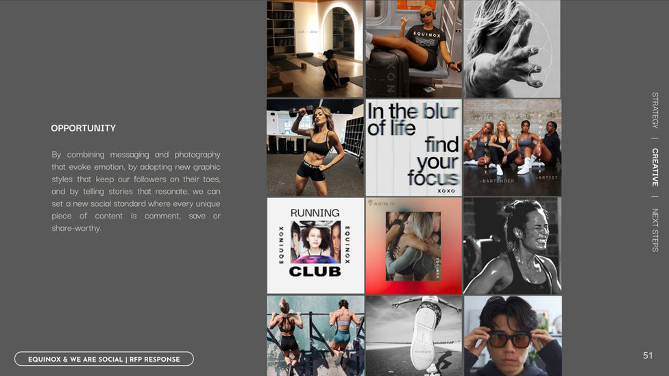
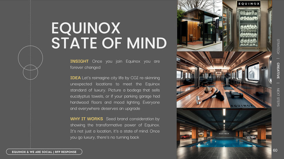
My background in both fitness and luxury came into play for this pitch. I’m proud of how the visuals evolved—as a team we pushed the work both aesthetically and conceptually. I introduced the line “Less Bodies, More Human” after noticing a lack of authentic imperfection and personality in the feed. Our recommendation was to reveal the deeper layers of the brand, much like an x-ray or infrared scan, which became the inspiration for the visual identity. We ideated several content series and partnerships, including interviews, BTS with trainers using Meta glasses, and home décor crossovers designed to bring the feeling of Equinox into your everyday. The goal was to create a world you could almost feel—intimate, intentional, and human.
GRAN CENTENARIO
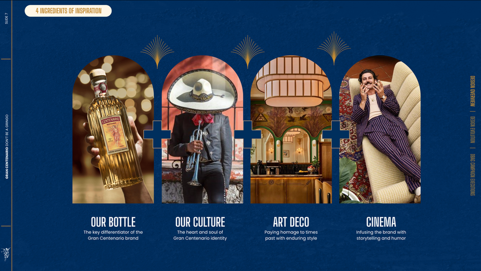
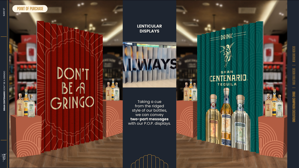
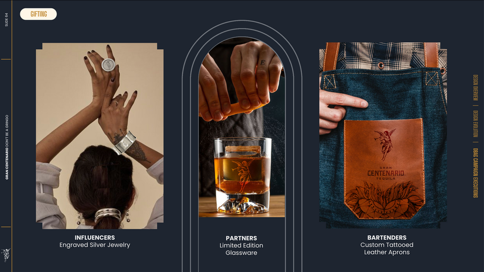
After winning the business, we began world-building from the product outward. The bottle itself informed the visual identity for 2025—its shapes, textures, and tones became the foundation for a new design system. Thematically, we drew from Art Deco architecture and Wes Anderson-style cinema to build a distinctive world around a bold, controversial tagline. I described it as putting a strong shot of tequila in a crystal glass. Our goal was to challenge the misperceptions and misrepresentations of Mexican culture in the U.S. by grounding the work in cultural truisms from the heart of Mexico—its craftsmanship, vibrancy, and intersection with American influences like cinema and design. The result was a refined yet spirited campaign that brought elegance, character, and cultural clarity to a heritage brand.
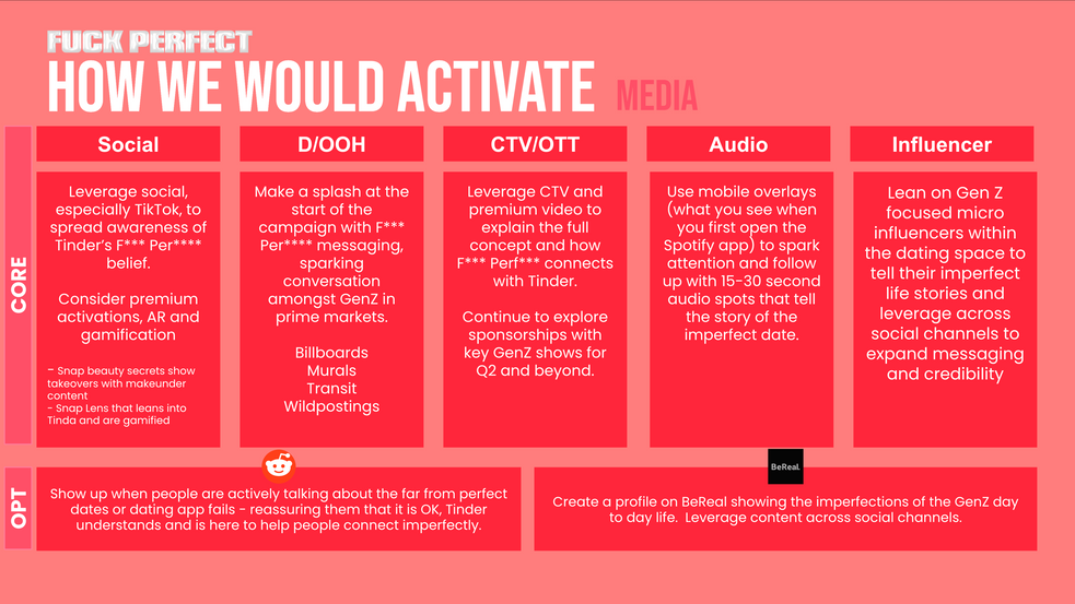
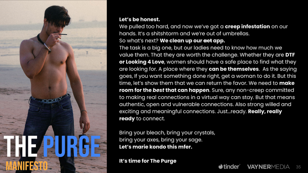
This one was a ride. I’d never used a dating app, so it was uncharted territory—but as a storyteller (and part-time modern anthropologist), I tapped into the mindset of the platform and its users. Our team went big, presenting three distinct creative directions: one bold, one familiar, and one unapologetically spicy. We didn’t win the pitch, but I was proud of the work—the messaging, the visuals, and the world we built around each territory all (in my opinion) hit the mark.


